THE CYNEPHILE

"The cinema is cruel like a miracle." -Frank O'Hara

Chroma [Derek Jarman, 1994]

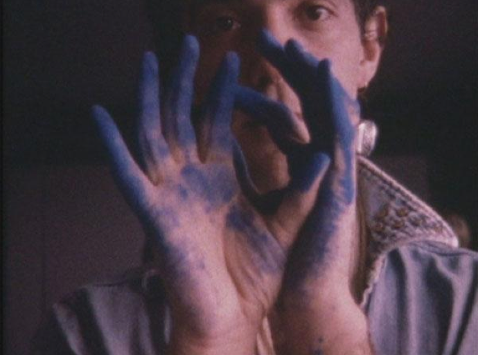
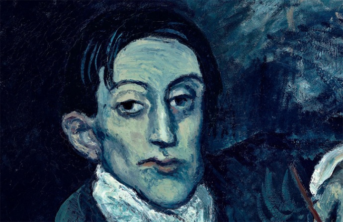
I have been thinking a lot about color, and about artists and their relationships to their materials. I myself am a color junkie, and dramatic color is like a shot of adrenaline to me. The directors/cinematographers who share my chromophilia — Vincente Minnelli, Antonioni, Almodóvar, and Zach Cardiff’s cinematography in The Red Shoes immediately come to mind — understand the emotional essence of each shade in the spectrum. Red excites and stimulates. Green is a sedative. Yellow vacillates between sunny and sickening. Orange is talkative. Blue is always one of two moods: Yves Klein Electric or Plaintive Picasso.

From Picasso's Blue Period: Portrait d’Angel Fernandez de Soto

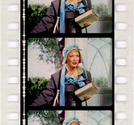
Lately I have been struck by the fact that the intensity of a certain hue is umbilically tied to its medium. Technicolor is indisputably the most significant development for color filmmaking in the 20th century, and one could argue that it precipitated a completely new approach to directing — new lighting, new make-up, even a new kind of acting. This is in stark contrast to digital filmmaking in which the majority of color correction happens in the post-production phase. Since the advent of digital, there has been a definite trend towards over-saturated colors that I would like to see go away, or at least toned down to avoid actors looking like Oompa-Loompas (then again, maybe they tan too much).

Becky Sharp, the first three-strip Technicolor film

But where does color come from? A filmmaker would think about color in terms of light or projection, but a painter would instantly think about paint and pigment. This understanding of color is first and foremost practical — pigments are not abstract, but material substances with chemical attributes. Paint has a particular consistency and texture. If you run out, you can’t complete your painting.

Derek Jarman’s book Chroma explores both the material and the spiritual implications of color, from the perspective on an artist who has worked in both painting and film. Written while Jarman was losing his eyesight due to complications from AIDS, it is an elegiac meditation on what colors signify, and how they exist in the real world. There are 19 vignettes in total, some named after different colors, along with essays on perspective, shadow and light, translucence, and iridescence.

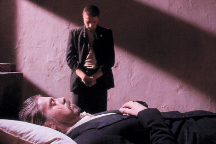
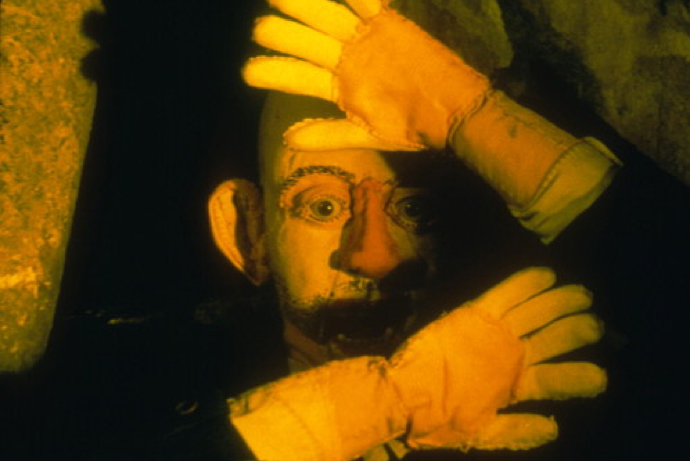
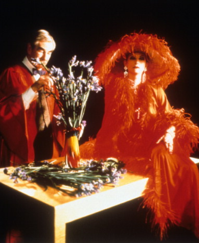
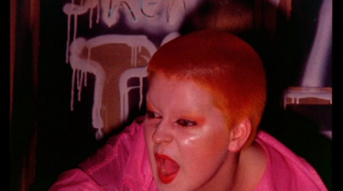
I find it fascinating to read Chroma against the backdrop of Jarman’s films, which run the gamut from grainy 8mm shorts to 35mm Technicolor features. Here are some excerpts juxtaposed against film stills that showcase Jarman’s innate feel for color, both as light and pigment.

Caravaggio, 1986

May my black Waterman ink spill out the truth.

Chemistry and romantic names — manganese violet, cerulean, ultramarine and distant places, Naples yellow. The geography of colour, Antwerp blue, raw Sienna. Colour stretching to the distant planets — mars violet; named after old masters — Van dyke brown. Contradictory — Lamp black.

1919. The world is in mourning. Kasimir Malevich paints White on White. A funeral rite for painting.

When yellow wishes to ingratiate it becomes gold.

The Tempest, 1979

Red is a moment in time. Blue constant. Red is quickly spent. An explosion of intensity. It burns itself. Disappears like fiery sparks into the gathering shadow.
Wasn’t Dorian Grey’s brain speckled with the scarlet stain of insanity?
Painters use red like spice.

Wittgenstein, 1993

Pink is always shocking. Naked. All those acres of flesh that cover the ceilings of the Renaissance. Pontormo is the pinkest painter.

Jubilee, 1977


I’m dreaming of a white Christmas. This song could only be sung in Southern California around a swimming pool.

Sloan Square, 1976

Leni’s full moon falling through a crystal grotto in the High Dolomites
Blue movies
Blue language
Bluebeard

The most stable of greens is the Terre Vert. The most elusive, the copper greens that turned all the Venetian paintings brown. Fugitive colour flies in time, and leaves us in a perpetual autumn.

The Last of England, 1987

How Now Brown Cow
There is nostalgia in brown. The touch of my mother’s soft beaver lamb coat in which we buried our tears. Brown simplified life.

Who has not gazed in wonder at the snaky shimmer of petrol patterns on a puddle, thrown a stone into them and watched the colors emerge out of the ripples…

Where did glass appear in my films? Faces distorted, pressed into the window.

And then there is Jarman’s Blue. Filmed in Technicolor, this cine-poem is both plaintive and electric, and is perhaps the saddest movie I have ever seen. It speaks for itself:
Picasso and Braque Go To the Movies [Arne Glimcher, 2008]

If the Met’s massive retrospective and MoMA’s concurrent exhibition of prints aren’t enough to satisfy Picasso devotees this spring, they will fortunately have recourse to yet another venue: the movie theater. Adding fuel to the Picasso frenzy is Arne Glimcher’s documentary Picasso and Braque Go To the Movies, a short but incisive look at how two of art history’s most prominent figures were influenced by the revolutionary medium of cinema. Narrated by none other than Martin Scorsese and featuring interviews with scholars and artists alike, the film doggedly makes the case that moving images exerted a profound influence over the formal development of Cubism, inspiring Picasso and Braque’s invention of a new kind of pictorial space in which, like cinema, reality is viewed from multiple angles at once.

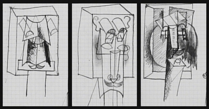
picasso_cinematograph_1912
Picasso’s sketches of a cinematograph? You be the judge. [1912]

Occasionally disjointed, the documentary assembles an impressive stream of early film excerpts punctuated with plentiful examples of Picasso and Braque masterpieces (often shown side by side) that fell under cinema’s spell. Film fanatics especially will delight in the early actuality footage of the Lumière brothers and the more fanciful, impish attractions conjured up by George Méliès. Interviews with artists, including contemporary heavyweights such as Chuck Close, Eric Fischl, Julien Schnabel and Coosje Van Bruggen offer intriguing analysis on the aesthetic links between cinema and Cubism, sometimes tying in their own artistic practice as well. (Eric Fischl, for example suggest that Cubist painters emulated cinematic projections by evoking a flickering light source at the edges of their canvasses.) However, those looking for an exploration of Picasso and Braque’s relationship will be disappointed: though the two artists (who were the undisputed Romulus and Remus of the movement) worked so closely together for a period of six years that some of their work was virtually indistinguishable from one another, very little is offered to explain their affinity and the equivalence between their work.

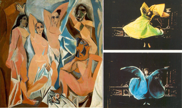
picasso_loie_fuller
The film makes the case that Picasso’s Les Demoiselles d’Avignon [1907} was inspired by the serpentine dance of Loïe Fuller.

While the overall premise is of the doc is fascinating, at times the execution leaves something to be desired–at its worst moments, the film plays like an exceedingly well-researched Powerpoint lecture. Rather than allowing the images to construct a vivid sense of the particular correspondences between Cubism and early cinema, the film is overly insistent of its argument, resorting to large-scale generalizations and weak suppositions. However, those that don’t mind its boilerplate History Channel approach will appreciate this in-depth study of the compelling intersection of art and film at the turn of the century.

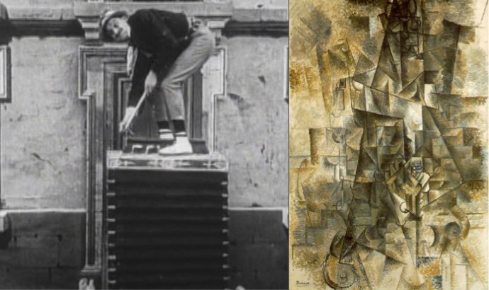
Accordion_Pathe_Freres_Picasso
A still from “The Accordion” [Pathé Frères, 1906] and Picasso’s “The Accordionist” [1911], underlining the conceptual similarity of early cinema and Cubism.

Picasso and Braque Go To the Movies is currently playing at Cinema Village in New York, NY.

Picasso, Nude Standing by the Sea, 1929

picasso_nude_standing_at_the_sea

This extraordinary painting, now on view at the Metropolitan Museum of Art as part of their massive Picasso exhibition, stands apart from the rest of his work for several reasons. The first reason is color: composed almost entirely in blue and white (with just the barest hint of yellow) it emerges as a minimalist piece, precisely because it lacks the riotous lightning bolts of color that characterize the Picasso we know so well. The second reason has to do with the composition: unlike most of his work, this painting has a clear figure/ground relationship: the nude is distinct and freestanding against a background of sea and sky. This is structurally different from most Picassos in which the environment and the figure merge into a single plane of dimensional disarray, shattering our concept of space forever.

Why is this painting so remarkably different from the rest of Picasso’s output at the time? Because this is a painting of a sculpture that never was. Picasso once had the idea of placing these monumental sculptures along La Croisette, the sea front at Cannes, but they never came into being. “I have to paint them,” he said “because nobody’s ready to commission one from me.” Wouldn’t it be incredible if someone could commission them today, to be a part of the backdrop at the Cannes Film Festival? Along with all of the celebrities, we’d have this uncanny and monstrous creature to add just the right amount of unreality to the proceedings, like a nude from outer space. Picasso, I think, would approve.