THE CYNEPHILE

"The cinema is cruel like a miracle." -Frank O'Hara

Piet Zwart, Monografieën over Filmkunst [1931]

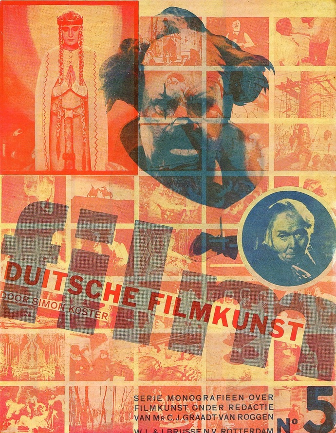
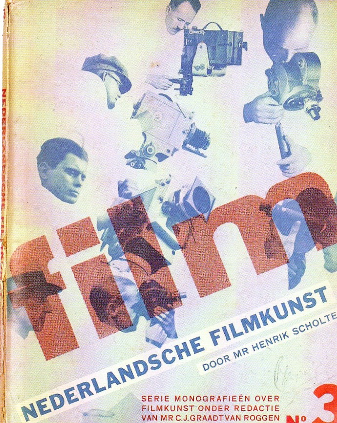
For this series of books dedicated to national cinemas and trends in filmmaking, the Dutch graphic designer Piet Zwart designed these incredible photomontage covers. Zwart is primarily known as a typotekt — a type architect! — but he was also dabbled in interior and industrial design, photography, criticism and teaching. I love the disembodied Mabuse heads and the bold red and blue color scheme. If you can name any of the films featured, drop a note in the comments and win a totally awesome cinephile prize! (Hint: use the titles as a jumping-off point.)


J.F. Otten, Amerikaansche Filmkunst [American Cinema]


Simon Koster, Duitse Filmkunst [Coastal German Cinema] P.S. Does anyone (besides Thomas Elsaesser) know anything about coastal German cinema? If you do, please share. (“Ooh ooh ooh I know!” –Thomas Elsaesser)


Constant van Wessem, De Komische Film [The Comedy Film]


C.J. Graadt van Roggen, Het Linnen Venster [The Linen Window] I am curious about the subject of this one. Anyone out there know? (Please put your hand down, Thomas Elsaesser.)


J.L.J. Jordaan, Dertig Jaar Film [Thirty Years Film]

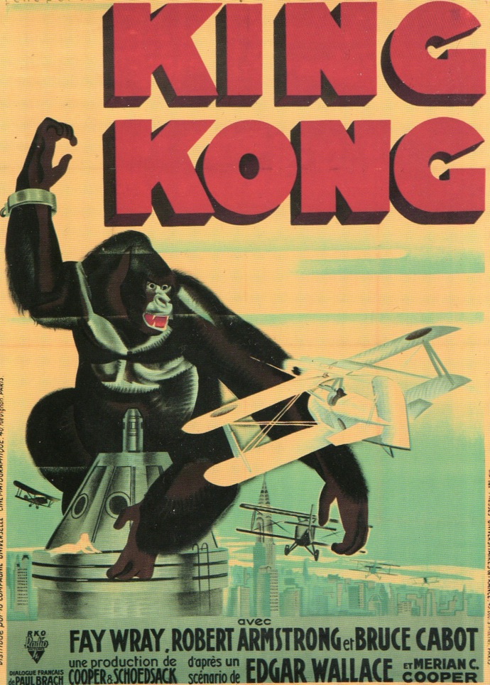
King Kong Movie Poster [Rene Peron, 1933]

In the United States, movie studios for the most part produced anonymous posters to promote films. In France, however, recognized poster designers were hired to advertise the films they distributed. Rene Peron was one of the leading figures of French film poster design, and over the course of his career, designed more than two thousand posters. King Kong premiered in America on March 3, 1933 and in France on March 16th, 1933. Peron illustrates the iconic scene where Kong is being attacked by airplanes on top of the Empire State Building. Peron’s graphic approach appears relatively straightforward, but look more closely for wonderful touches of Art Deco stylization and lovely use of an airbrush. And oh man, those colors! Pomegranate red, mustard yellow and celadon green have never looked so groovy together. You can just hear M. Kong singing: I’m an apeman, I’m a King Kong man, I’m a voodoo man (Distributed by La Compagnie Universelle Cinématographique; printed by Presses Universitaires de France, Paris.)

Ed Ruscha and Film

ed_ruscha_miracle_film_still
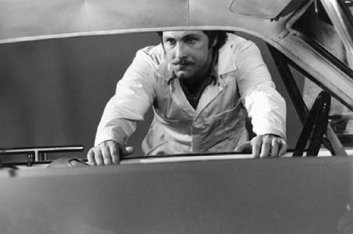
A B&W still from Ed Ruscha’s film Miracle [1975].

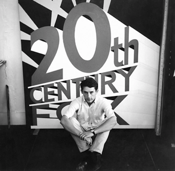
After catching Ed Ruscha’s rare early films at Anthology — two utterly sublime set pieces that riff on the American holy trinity of cars, food, and women — I wanted to gather together all of Ruscha’s art that directly referred to cinema. This proved to be an impossible task, for the L.A. artist absorbed movie aesthetics the way a sponge absorbs water. A certain disaffected cinematic consciousness imbues almost all his photographic work, especially his exercises his serialism [Twentysix Gasoline Stations, Thirtyfour Parking Lots]. These photographs could be establishing shots from an LA film noir, or alternately, Ruscha could be conceived as donning an industry role: the artist as location scout. I like Ruscha’s description of how movies made unknown places known to him, and virtually paved the way for his arrival.

ed_ruscha_portrait

When I first went to New York at about age 20 I felt like I was in a familiar land. Movies laid out the carpet that I would walk down to see the city. It was kind of like going to Oz. The same thing happened with LA. It seemed like movies initiated me to new lands. I can’t be exactly specific, but I’m inspired by the clichéd activities in films. For example, in movies from the 40s there was always a train that was depicted as a little spot in the lower right hand corner of the screen and it would always emerge with all of its whistles and steam in the upper left hand side of the frame. It was a bridge between plot action when people were moving from one place to another. It had a powerful, cinematic suggestion to me that directly came into my work as an artist. I still dig the diagonal (laughs). [Excerpted from an interview in Fabrik Magazine]

ed_ruscha_back_of_hollywood

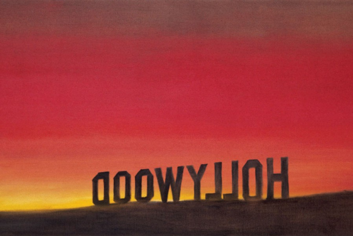
I dig the diagonal too, which is a powerful compositional element of not only Ruscha’s photographs but his drawings. Several of his most-lauded pieces play with angles and anamorphotics of famous cinematic landmarks and logos, such as the Hollywood sign as viewed from behind and from the side, where the stagecraft used to the erect the letters is revealed.

ed_ruscha_hollywood_sign

ed_ruscha_western

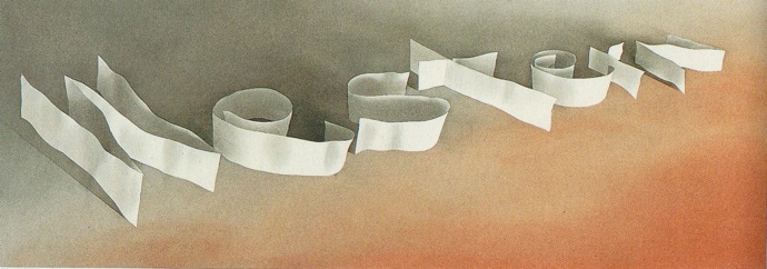
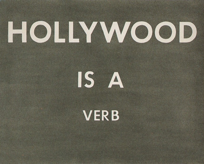
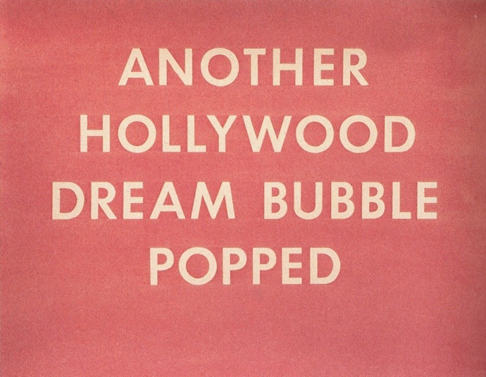
Hollywood as a metonym figures prominently in his text constructions as well, which are reminiscent of title cards, billboards, or signage. Of course Ruscha would write HOLLYWOOD IS A VERB, emerging from a smog made up of hazy graphite. ANOTHER HOLLYWOOD DREAM BUBBLE POPPED evokes a rosy-fingered mirage.

ed_ruscha_hollywood_is_a_verb

ed_ruscha_another_hollywood_dream_bubble

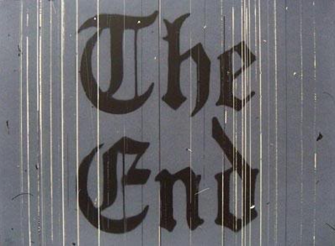
Ruscha loved the end credits, and that last title card appears in several of his later drawings. They specifically capture the materiality of cinema by showcasing the scratches and lines that characterize a worn-out film print. Part of the reason why Ruscha’s films are not well-known is because he insists that they be shown on film, insisting on their original medium (and perhaps damning them to obsolescence). One can almost hear the faint whirring of the projector as it reaches the end of the reel.

ed_ruscha_scratches_on_the_film

A Pot-pourri of Links

art + video
It’s Armory Week, and the number of openings, events and parties in the next few days makes my head spin. Aside from the usual mainstays, the new kid on the block this year is the Independent. Born out the ashes of X-initiative, it offers an alternative to the inescapable shopping mall ambiance of the art fair — there’s even a panel on gluttony! And a film program too. Check it out here.

Scope also has a video program, with work by Martha Colburn, George Kuchar and fashion-y films. Sashay!

design
Check out the next generation of Polish film poster design.

fashion
Look who’s copying a page from the Vezzoli playbook: Agyness Deyn deigns to appear in a McDermott and McGough film.

film reviews
Andrew Grant (nom de blog: filmbrain) reviews The Ghost Writer, and thinks it’s pretty good.
You should see it, especially since all proceeds from the film go to the Roman Polanski legal defense fund. (Kidding!)

mystery flavor
My favorite posthuman Andrei Codrescu is anti-Avatar, and pro-zombie. Deliciously brainy as always.

zombie_vampire_hybrid
My friend Ziyan and I as zombie-vampire hybrids. Kristen Stewart, eat your heart out.

new york
Movie program ephemera from the 8th street Playhouse, which I remember going to as a little girl. Thanks to reader Jack for the tip.

photography
Andy Warhol: Unexposed Exposures just opened at Steven Kashar.
If the Factory had had a facebook page, these would be the pictures that they would post to their wall. Lots o’ pics online too.

watch online
The first and only truly Beat film Pull My Daisy (Frank and Leslie, 1959) is on Google Video.

Herbert Bayer, Designs for a Cinema [1924-5]

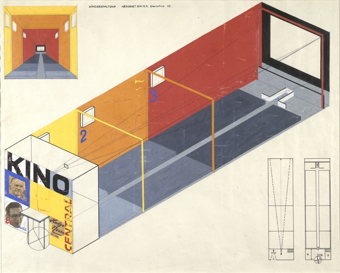
This weekend is your last chance to catch MOMA’s Bauhaus exhibit, which is enlightening because it reveals that its practitioners (check out those cool cats below) were far from uniform in their approach to art, architecture and life. For me, the big discovery was Herbert Bayer’s design for a cinema [1924-25] and what he calls a “multimedia” trade fair stand to be used for advertising purposes [1924].


In da Bauhaus (actually they were on the roof. Herbert Bayer is fifth from the left.)

Bayer’s design for a cinema is notable for what it lacks: it dispenses with a marquee, which was designed to “embrace” the potential moviegoer on the street and funnel him into the theater. The revolving door is more characteristic of a department store. And I have no idea what those three primary colored zones are meant to indicate. But one can immediately see that this cinematheque is the exact opposite of the movie palaces of the 1920’s, which were derived from theater architecture and were intended to create an opulent and exotic experience.
Even more radical is this multimedia kiosk for a fictional brand of toothpaste, “Regina.” Presumably the booth would lure you in with the sound of her voice.

Bayer is most well known as a type designer. He was a proponent of the almost ubiquitous use of all lowercase letters, and he created the quintessential Bauhaus font Universal, which still looks fresh today. But he also wrote presciently about exhibition design in a way that anticipates future developments in digital media:

“Exhibition design has evolved as a new discipline, as an apex of all media and
powers of communication and of collective efforts and effects. The combined
means of visual communication constitutes a remarkable complexity: language
as visible printing or as sound, pictures as symbols, paintings, and photographs,
sculptural media, materials and surfaces, color, light, movement (of the display
as well as the visitor), films, diagrams, and charts. The total application of all
plastic and psychological means (more than anything else) makes exhibition
design an intensified and new language.”

Here, film is subsumed under a multimedia gesamtkunstwerk that attempts to alter all aspects of the user’s experience. It was already considered just one tool in the virtual reality shed as early as the 1920’s.