THE CYNEPHILE

"The cinema is cruel like a miracle." -Frank O'Hara

Marilyn Monroe: Actress, Icon, ______

Marilyn Monroe was known for two things above all: a dazzling smile and a tremor in her voice. On the screen, those features were shaped into a surprisingly varied cast of characters. The Marilyn who knocked everybody out cold in Some Like it Hot is different from the Marilyn who almost stole Monkey Business right out from under Ginger Rogers’ nose. And the show-stopping Marilyn who proved, once and for all, that Gentlemen Prefer Blondes is yet another Marilyn, a four-alarm fire practically burning a hole through the screen in Niagara.

She had considerable dramatic range as an actress, and a well-honed sense of comedic timing. As Montgomery Clift’s character Perce Howland mulls in The Misfits, “She’s kinda hard to figure out, you know? One minute she looks kinda dumb and brand-new, like a kid… and the next minute…” Her character, as well as the actress herself, remains an enigma, to be showcased in BAMcinématek’s series, Marilyn!, from July 1 to 17.

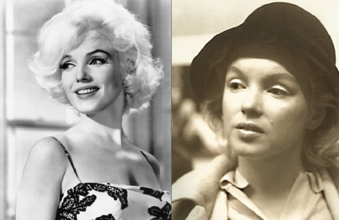
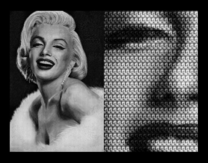
But first, let us consider Marilyn’s mythic projection, or Monroe the icon. This Marilyn is indelibly written into our consciousness as the golden, open-faced beauty, epitomizing a healthy American sexuality and a vulnerable, childlike innocence. Here, all the nuance of her myriad characterizations is lost, and she becomes a series of frozen images. This is the Marilyn from The Seven Year Itch who felt the gust of air from the subway grate, immortalized with her dress blooming around her like a flower. This is Andy Warhol’s silkscreened Marilyn, her celebrity reduced to her mug in a rainbow of colors reproduced ad infinitum. This is Marilyn in the realm of high camp, draped in diamonds and surrounded by ostrich plumes, cooing “Diamonds Are a Girl’s Best Friend.” There are abundant variations on this theme but the girl at the center remains the same: an erotic fantasy, an imaginary creature that can only exist in the cinema.

"Marilyn Vs Brigitte Bardot" by Alex Guofeng Cao

Monroe’s beginnings were far from auspicious. The woman who was to become a universally known and loved icon of the 20th century was born Norma Jeane Mortenson in Hollywood. Her mother was a film cutter at RKO Studios who, widowed and mentally ill, abandoned her to a sequence of foster homes. Monroe’s childhood was marked by crippling poverty and abuse, and she married at 16. It was then that she started to achieve some success as a model and was scouted by Howard Hughes, then the head of RKO Studios. He offered her a screen test but she ended up signing with 20th Century Fox. Her first major break as an actor was in John Huston’s gritty LA film noir, The Asphalt Jungle, in which she played a memorable mistress that lit up each of her scenes. She won another small but significant role in Joseph Mankiewicz’s All About Eve, in which she held her own among a formidable cast that included Bette Davis and Anne Baxter. Mankiewicz predicted her rise to fame, claiming that she had that certain indescribable something, that ineffable star quality. Watching All About Eve, it is evident that Marilyn knew she had it too.

But she wanted to play more than arm candy. In addition to roles for which Monroe is celebrated, the BAMcinématek series includes some underrated gems that never achieved box-office success but nevertheless remain crucial landmarks in her development as an actress. The first of these is Don’t Bother to Knock, her first serious role in which she plays a mentally unhinged babysitter. She’s unstable and creepy, and it’s thrilling to watch her face morph from hardened to sweet to insecure in an instant. Still another role in which she expands her repertoire is opposite Robert Mitchum in the thrilling action epic River of No Return, shot in lush CinemaScope. But if you see just one film from this series, let it be John Huston’s twilight Western, The Misfits, penned especially for her by her then-husband, playwright Arthur Miller. Film critic Pauline Kael wrote of Marilyn dismissively, proclaiming “When she was ‘sensitive’ she was drab,” but Monroe has never been more sensitive than in The Misfits, and has never looked more radiant. Miller wrote this role particularly with Monroe’s dramatic strengths and biography in mind, and it’s astounding to watch. It’s also the last film that she completed.

Shy, bright, sensitive, and unaffected, Monroe hated being a star. She was the woman most fantasized about by men (a fact that embarrassed her), yet fame became a painful thorn. It’s an old story, but still a sad one, and whatever factors contributed to her untimely death, one thing is certain: Marilyn was made for the medium of film.
Hooray for Bollywood Posters!

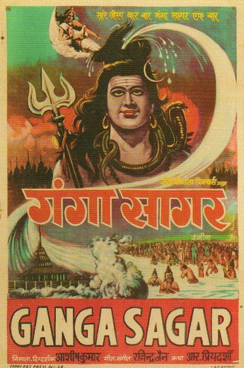
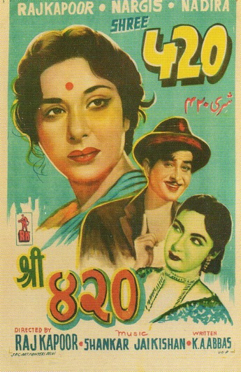
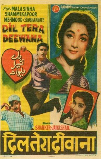
Here are some Bollywood posters I came across. I love the way these are screenprinted (does anyone know anything about the particular method/technique?) and the unbleached brown paper. According to J.D. Salinger: “Brown paper, especially wrapping paper, is very pleasant, very cozy to paint on. Many an experienced artist has used it when he wasn’t up to anything grand or grandiose.”

A Square Supreme: Malevich and the American Legacy

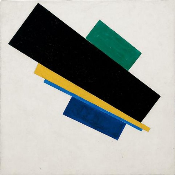
Even without the Americans, the Kazimir Malevich show at Gagosian Gallery would be an event. The show features an impressive six paintings, four of which are superb examples of the Suprematism, the movement Malevich founded and that would become a linchpin of abstraction in the twentieth century. In all likelihood, audiences will never have a chance to see these pieces together again, because they reside with the heirs of the Malevich estate and in museum collections. They are emphatic and self-sufficient, claiming the wall allotted to them in the gallery despite their diminutive size and declaring themselves irrefutably present. They do not need external validation nor a litmus test of their influence, because their influence is everywhere.

The Gagosian show has the salutary effect of placing examples of American minimalism in apposition to Malevich’s truly formidable vision. It’s up to the Americans to prove themselves worthy of the Russian master, and most do, though sometimes that lineage is muddled. Though Malevich flipped the switch on painting as early as 1915 with the revolutionary Black Square, the gravitas of his formal composition was not felt in America until 1973 when the Guggenheim mounted a retrospective. The Americans were late to feel the full impact of Suprematism from Malevich’s mouth, but received it as hearsay from numerous European sources, most notably Mondrian.

Donald Judd, art-reviewer, recognized Malevich as ground zero for abstraction, writing “It’s obvious now that the forms and colors in the paintings that Malevich began painting in 1915 are the first instances of form and color.” For Malevich, art was about two things: the square and the void. Every other form derived from the square, which was an absolute construction that was for him, commensurate to “pure feeling”. I saw it yesterday and I’m still very far from being able to think intelligently about it — the show is very difficult, and despite its relatively small size, there’s still far too much there. I like to think of myself as a little bit capable of looking at art, but an exhibit like this could probably retrain anyone’s eye.

Malevich wrote several articles on film and briefly worked with Hans Richter on a non-objectivist piece for the cinema. He spoke of the “missed encounter” between film and art, and saw infinite potential in the medium.

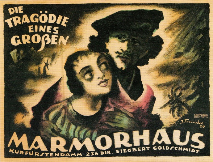
Josef Fenneker, The Tragedy of a Great Man

Within a decade after he settled in Berlin, in 1918, Josef Fenneker designed more than 300 movie posters. He primarily worked for two movie houses, the Mamorhaus and the Mozartsaal, but he also designed images for the large German movie producer UFA. From the beginning of his career, Fenneker developed his own personal style, which drew largely on German Expressionism combined with a flair for decadence.

He primarily depicted elongated and distorted figures emerging from dark backgrounds, and punctuated them with unusual, hand-drawn typography. This poster is for the silent film The Tragedy of a Great Man, the story of Rembrandt van Rijn. The atmospheric image, with its murky background offset by the wide, adoring eyes of Saskia (Rembrandt’s wife) is a fascinating confluence of Old Master and German Expressionism.

3D: A Study in Depth

Film Forum is in the midst of a Classic 3D film series that is eye-bulgingly essential for anyone who cares about the past and future of cinema. I dragged a friend to see KIss Me Kate on Sunday and we were transported to such a state of euphoria (spinning diamonds! saucy lyrics! silly outfits! jazz hands! gangsters spouting Shakespeare!) that leaving the theater was like coming out from under ether. (Admittedly this experience was augmented by some ‘50s-era wax soda bottles from Economy Candy that gave us both a suitable sugar high.) According to the trailer, Kiss Me Kate was the greatest event in the history of our times:

Kate is that great, and those who delight in the golden era of 3D will be knocked out by Film Forum’s pristine dual projection. Moreover, cinephiles who are sickened by the success of the behemoth Avatard and the bumper crop of unnecessary 3D titles that it has spawned will get a much better sense of the untapped potential of “depthies,” then and now.

First things first: all filmmaking is three-dimensional in the sense that motion pictures provide many depth cues that we also use on a daily basis to perceive the visual world. However, stereoscopic cinema maintains the illusion of extending into the space of the audience, going boldly where no movie had gone before.

One could make the argument that three-dimensional cinema is inherently more realistic, because it locates objects in space, rather than on a flat, two-dimensional plane. And it certainly expands the visual field, bringing the spectator seemingly closer to the image. However, it is more accurate to say that three-dimensional is hyper-realistic, or radically exhibitionist, because instead of the spectator’s vision directed “inward” towards the screen, the image is literally directed “outward” towards the spectator. The 3D film, in essence, does the work of perception for the spectator—it commands us to focus on this character or that part of the mise-en-scène, simply by the jutting out of certain pictorial elements over others.

3D cinema, therefore does the finger-pointing for us — look at this here, right now! A 3D model of spetatorship is inherently anti-Bazinian because it rejects any notion of the interior life of the screen image — and infantilizes the spectator who prefers to let his eye roam over the image. I think this explains why die-hard cinephiles dismiss these films as passing novelties, films in which objects were hurled at the spectator and film art was nary a concern — the cinematic equivalent to a paintball game. However, a surprising number of prestigious and high-budget features were shot using 3-D (but not necessarily released that way). The list is impressive: it includes Kiss Me Kate, along with House of Wax, The Charge at Feather River, Miss Sadie Thompson, Creature from a Black Lagoon, and Dial M for Murder.

Dial M for Murder is a example of how three dimensional processes can be used to create effects that transcend mere gimmicks; Hitchcock shows admirable restraint and allows for the action of the film to dictate 3-D movement along the Z-axis. The film is based on a stage-play, and most of the action takes place in the living room of a London apartment. (As a director, Hitchcock had a definite techno-fetish, exploring rear-screen projection, matte, and other unconventional techniques. 3D was no exception, though Hitchcock was a late adopter, coming around to the process in 1954.) In Dial M for Murder, composition and movement are carefully controlled: the first half of the film is static and consists only of subtle maneuvering between lamps, chair arms, and other household items jutting out in front of the actors. Every shot was masterfully executed with proper camera movement and very precise convergence.

Dial M for Murder contains three outstanding examples of 3-D virtuosity. First are the tight, extreme close-ups on wristwatches; second, the suspenseful shot of a telephone dial as the murderer pokes his finger into the number six hole, the titular “M.” Both shots were faked using a giant prop technique, making it possible to manage extreme close-ups without inflicting eyestrain, and demonstrating Hitchcock’s ingeniousness for outwitting the limitations of 3D.

Hitchcock’s most obvious and effective three-dimensional moment comes during the murder itself: As the murderer attempts to strangle poor gorgeous Grace Kelly, she is forced back across her desk, and her grasping hand is thrust out at the audience as she reaches for scissors to stab the murderer. Even here Hitchcock demonstrates restraint, as the movement of the stabbing goes away from the camera rather than toward the camera and audience. I saw a 3D projection of Dial M for Murder a number of years ago and I’ve never forgotten this scene. It’s playing Aug 21 and 22 at Film Forum — don’t miss this!

The White Rose [Bruce Conner, 1967]

Film Forum is doing a Bruce Conner retrospective in November, and I am eagerly anticipating seeing the short The White Rose up on the big screen. I’ve only viewed it via Tudou (which also has uploads of Conner’s seminal A Movie and Vivian).

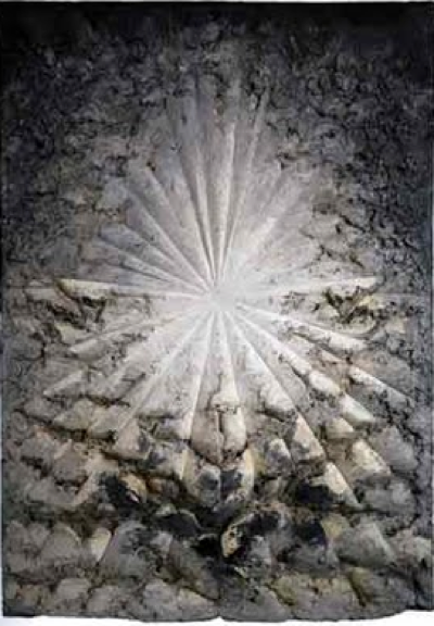
The Beat artist Jay DeFeo spent many years of her life painting just one massive picture. Eleven feet tall, eight feet wide, and weighing almost a ton, it grew so heavy from the built-up layers of pigment that it had to be removed from her studio by cutting away the wall and lifting it out via crane. This process is memorialized by Conner (a close friend) with an almost clinical austerity, augmented by a melancholy Gil Evans soundtrack.

What happened to the painting after the film? It was rarely exhibited due to its size and precarious condition, and was put into storage and plastered over to keep slabs of pigment from breaking off the surface. It was eventually acquired by the Whitney and uncovered many years later. For most viewers, the primary means of encountering Defeo’s legendary painting was through Connor’s film. A protest as well as a lament, The White Rose is a singular testament to Defeo’s life work — a mammoth flower that rarely saw the light of day, but bloomed through the light of the projector.

More: John Perreault’s Artopia essay on “The Rose”

Street Art on Film

THE CYNEPHILE needs to build up its street cred, ergo a post about street art! (and with the term, ergo, I destroy any possibility of having any ‘cred’ whatsoever…sigh). Anyway I am deliberately using the term street art instead of graffiti, because I do think the two practices differ in important ways. Banksy’s latest film, Exit Through The Gift Shop, does a good job at elucidating the differences between bombing subways and tagging to a more illustration-based & three-dimensional approach, starting with Space Invader (pew! pew! pew! pew!).

Aside from Banksy’s annoying burka-cum-voice-distortion routine, this film is actually very funny, and an excellent primer on the evolution of street art. The title, as you have already deduced because you are infinitely smarter than me, is a comment on street art’s institutionalization and commercialization. What happens when you take an art form predicated on the defiance of authority and stick it in a museum? You get rules and “don’t touch” signs and mugs emblazoned with Andre the Giant — lame.

But if you want to travel back to street art’s roots (aka graffiti) you HAVE to watch Style Wars, the definitive doc on the subject.This film was way ahead of its time (it was shown on PBS) and is mostly good when it doesn’t revert back to a slightly problematic voice-of-god narration mode. (*cough *cough “To some it’s art. To most people however, it is a PLAGUE that NEVER ENDS.” ahem).


The best part? Some kindred spirit has uploaded the entire film onto YouTube!

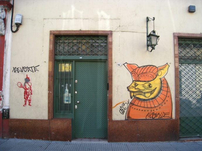
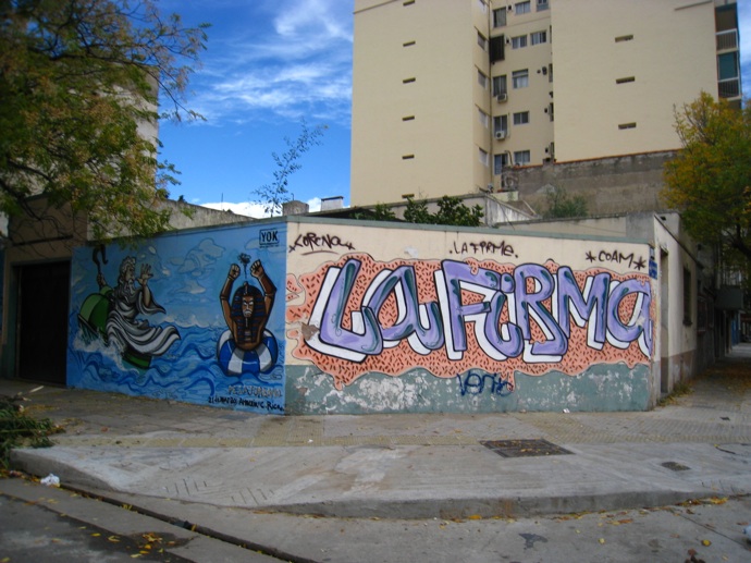
When I was in Buenos Aires, I saw some really amazing large-scale street art. Is taking pictures of graffiti touristy? Do I somehow betray my native New Yawk by praising another city’s street art? If so, I am a geeky tourist and a shameless traitor.

And then there’s Blu, the graffiti artist whose animations have been making the rounds on the web. I would give my eyes, ears, nose and throat to see Blu in action. (ok maybe not all of those). Blu is an Italian graffiti artist that paints narratives that unfold over time. He creates something, takes a picture, changes it a little bit and then takes another photo. All of these photos put together at warp speed become a film — but instead of happening on an old-fashioned animation cell it happens on public surfaces. (Take that, Walt Disney.)

MUTO a wall-painted animation by BLU from blu on Vimeo.

Doesn’t Blu make Banksy look like a one-note hack? And isn’t street art like this so wondrous and full of potential?

More:
Street Art vs. Graffiti
Hollywood in Cambodia, a Street Art gallery in Buenos Aires (a play on the Dead Kennedy’s song Holiday in Cambodia)

Ed Ruscha and Film

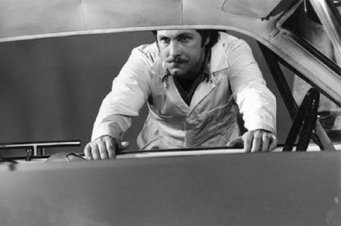
ed_ruscha_miracle_film_still
A B&W still from Ed Ruscha’s film Miracle [1975].

After catching Ed Ruscha’s rare early films at Anthology — two utterly sublime set pieces that riff on the American holy trinity of cars, food, and women — I wanted to gather together all of Ruscha’s art that directly referred to cinema. This proved to be an impossible task, for the L.A. artist absorbed movie aesthetics the way a sponge absorbs water. A certain disaffected cinematic consciousness imbues almost all his photographic work, especially his exercises his serialism [Twentysix Gasoline Stations, Thirtyfour Parking Lots]. These photographs could be establishing shots from an LA film noir, or alternately, Ruscha could be conceived as donning an industry role: the artist as location scout. I like Ruscha’s description of how movies made unknown places known to him, and virtually paved the way for his arrival.

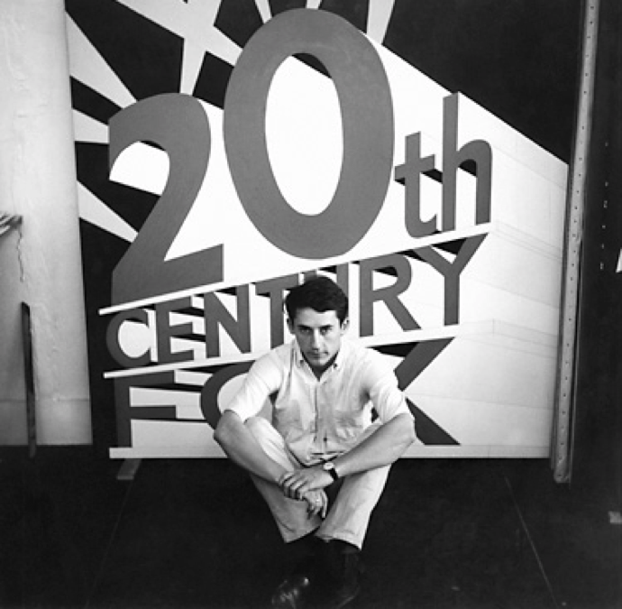
ed_ruscha_portrait

When I first went to New York at about age 20 I felt like I was in a familiar land. Movies laid out the carpet that I would walk down to see the city. It was kind of like going to Oz. The same thing happened with LA. It seemed like movies initiated me to new lands. I can’t be exactly specific, but I’m inspired by the clichéd activities in films. For example, in movies from the 40s there was always a train that was depicted as a little spot in the lower right hand corner of the screen and it would always emerge with all of its whistles and steam in the upper left hand side of the frame. It was a bridge between plot action when people were moving from one place to another. It had a powerful, cinematic suggestion to me that directly came into my work as an artist. I still dig the diagonal (laughs). [Excerpted from an interview in Fabrik Magazine]

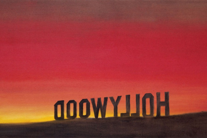
ed_ruscha_back_of_hollywood

I dig the diagonal too, which is a powerful compositional element of not only Ruscha’s photographs but his drawings. Several of his most-lauded pieces play with angles and anamorphotics of famous cinematic landmarks and logos, such as the Hollywood sign as viewed from behind and from the side, where the stagecraft used to the erect the letters is revealed.

ed_ruscha_hollywood_sign

ed_ruscha_western

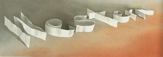
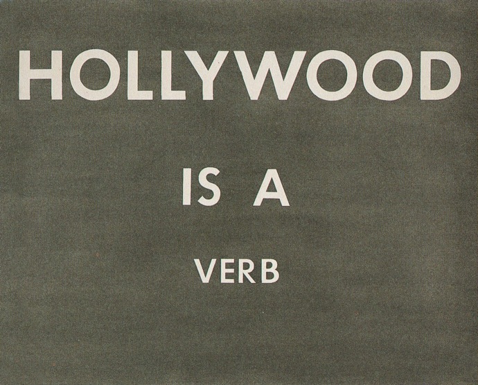
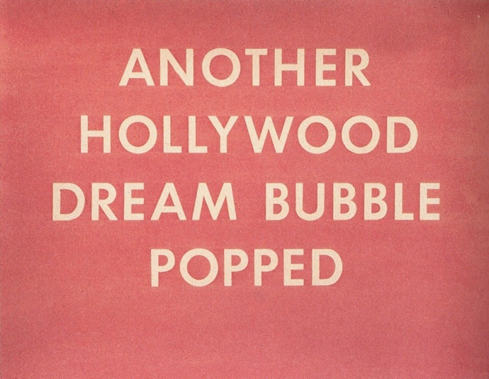
Hollywood as a metonym figures prominently in his text constructions as well, which are reminiscent of title cards, billboards, or signage. Of course Ruscha would write HOLLYWOOD IS A VERB, emerging from a smog made up of hazy graphite. ANOTHER HOLLYWOOD DREAM BUBBLE POPPED evokes a rosy-fingered mirage.

ed_ruscha_hollywood_is_a_verb

ed_ruscha_another_hollywood_dream_bubble

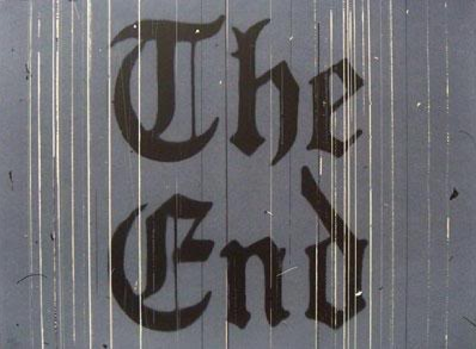
Ruscha loved the end credits, and that last title card appears in several of his later drawings. They specifically capture the materiality of cinema by showcasing the scratches and lines that characterize a worn-out film print. Part of the reason why Ruscha’s films are not well-known is because he insists that they be shown on film, insisting on their original medium (and perhaps damning them to obsolescence). One can almost hear the faint whirring of the projector as it reaches the end of the reel.

ed_ruscha_scratches_on_the_film

Picasso and Braque Go To the Movies [Arne Glimcher, 2008]

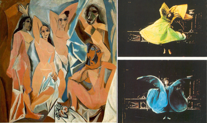
If the Met’s massive retrospective and MoMA’s concurrent exhibition of prints aren’t enough to satisfy Picasso devotees this spring, they will fortunately have recourse to yet another venue: the movie theater. Adding fuel to the Picasso frenzy is Arne Glimcher’s documentary Picasso and Braque Go To the Movies, a short but incisive look at how two of art history’s most prominent figures were influenced by the revolutionary medium of cinema. Narrated by none other than Martin Scorsese and featuring interviews with scholars and artists alike, the film doggedly makes the case that moving images exerted a profound influence over the formal development of Cubism, inspiring Picasso and Braque’s invention of a new kind of pictorial space in which, like cinema, reality is viewed from multiple angles at once.

picasso_cinematograph_1912
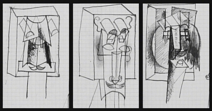
Picasso’s sketches of a cinematograph? You be the judge. [1912]

Occasionally disjointed, the documentary assembles an impressive stream of early film excerpts punctuated with plentiful examples of Picasso and Braque masterpieces (often shown side by side) that fell under cinema’s spell. Film fanatics especially will delight in the early actuality footage of the Lumière brothers and the more fanciful, impish attractions conjured up by George Méliès. Interviews with artists, including contemporary heavyweights such as Chuck Close, Eric Fischl, Julien Schnabel and Coosje Van Bruggen offer intriguing analysis on the aesthetic links between cinema and Cubism, sometimes tying in their own artistic practice as well. (Eric Fischl, for example suggest that Cubist painters emulated cinematic projections by evoking a flickering light source at the edges of their canvasses.) However, those looking for an exploration of Picasso and Braque’s relationship will be disappointed: though the two artists (who were the undisputed Romulus and Remus of the movement) worked so closely together for a period of six years that some of their work was virtually indistinguishable from one another, very little is offered to explain their affinity and the equivalence between their work.

picasso_loie_fuller
The film makes the case that Picasso’s Les Demoiselles d’Avignon [1907} was inspired by the serpentine dance of Loïe Fuller.

While the overall premise is of the doc is fascinating, at times the execution leaves something to be desired–at its worst moments, the film plays like an exceedingly well-researched Powerpoint lecture. Rather than allowing the images to construct a vivid sense of the particular correspondences between Cubism and early cinema, the film is overly insistent of its argument, resorting to large-scale generalizations and weak suppositions. However, those that don’t mind its boilerplate History Channel approach will appreciate this in-depth study of the compelling intersection of art and film at the turn of the century.

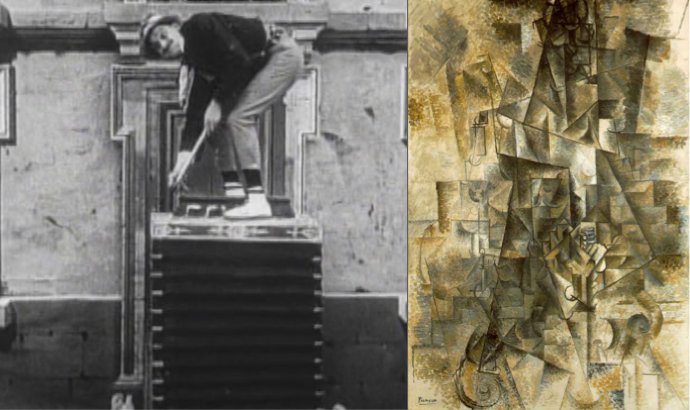
Accordion_Pathe_Freres_Picasso
A still from “The Accordion” [Pathé Frères, 1906] and Picasso’s “The Accordionist” [1911], underlining the conceptual similarity of early cinema and Cubism.

Picasso and Braque Go To the Movies is currently playing at Cinema Village in New York, NY.

Picasso, Nude Standing by the Sea, 1929

picasso_nude_standing_at_the_sea

This extraordinary painting, now on view at the Metropolitan Museum of Art as part of their massive Picasso exhibition, stands apart from the rest of his work for several reasons. The first reason is color: composed almost entirely in blue and white (with just the barest hint of yellow) it emerges as a minimalist piece, precisely because it lacks the riotous lightning bolts of color that characterize the Picasso we know so well. The second reason has to do with the composition: unlike most of his work, this painting has a clear figure/ground relationship: the nude is distinct and freestanding against a background of sea and sky. This is structurally different from most Picassos in which the environment and the figure merge into a single plane of dimensional disarray, shattering our concept of space forever.

Why is this painting so remarkably different from the rest of Picasso’s output at the time? Because this is a painting of a sculpture that never was. Picasso once had the idea of placing these monumental sculptures along La Croisette, the sea front at Cannes, but they never came into being. “I have to paint them,” he said “because nobody’s ready to commission one from me.” Wouldn’t it be incredible if someone could commission them today, to be a part of the backdrop at the Cannes Film Festival? Along with all of the celebrities, we’d have this uncanny and monstrous creature to add just the right amount of unreality to the proceedings, like a nude from outer space. Picasso, I think, would approve.